
Credit Card Compare Tool
U.S. News & World Report
Challenge
The Credit Cards Compare Tool for U.S. News & World Report is the third highest revenue generating page for the Money vertical. However, the design and code had not been updated for several years and there were a number of issues and opportunities discovered. The business believed there was an opportunity to make the Credit Cards Compare Tool the first or second highest revenue generating page.
UX issues that are likely reducing Conversion Rate.
The way the tool was setup to be all on one page made it difficult for the business to track useful analytics data.
Regulatory/compliance issues with current tool setup.
Old bloated code.
Solution
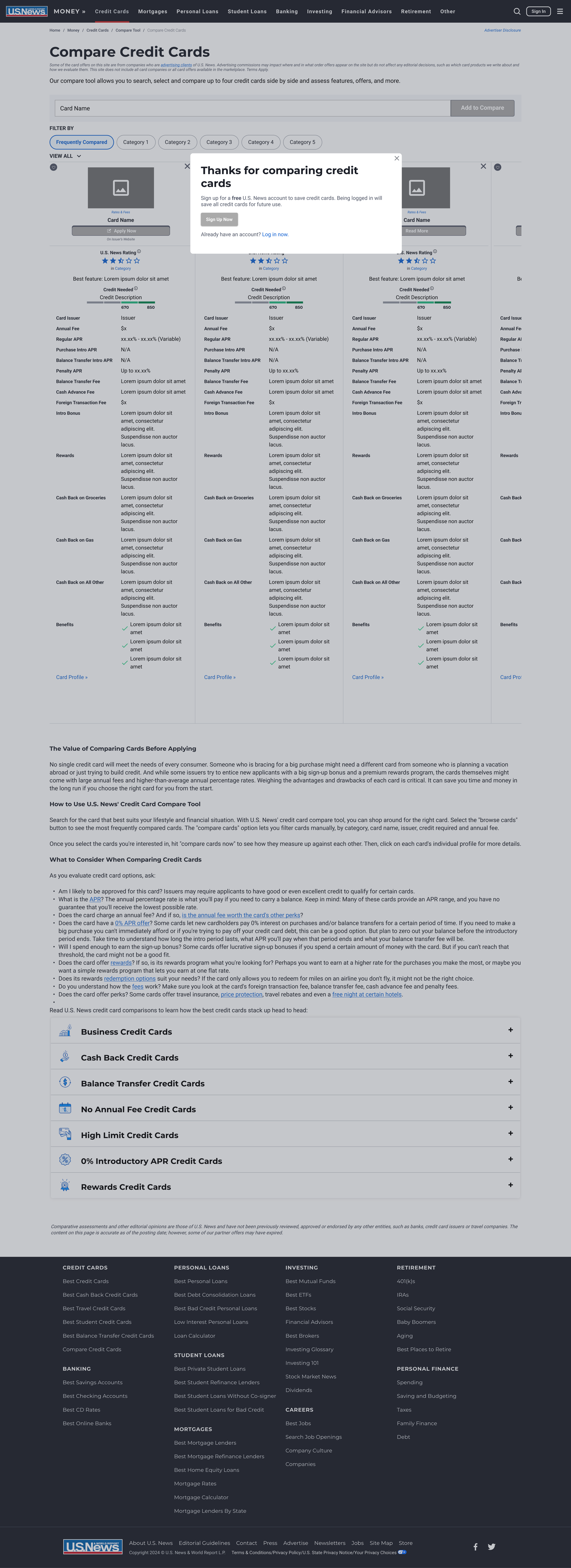
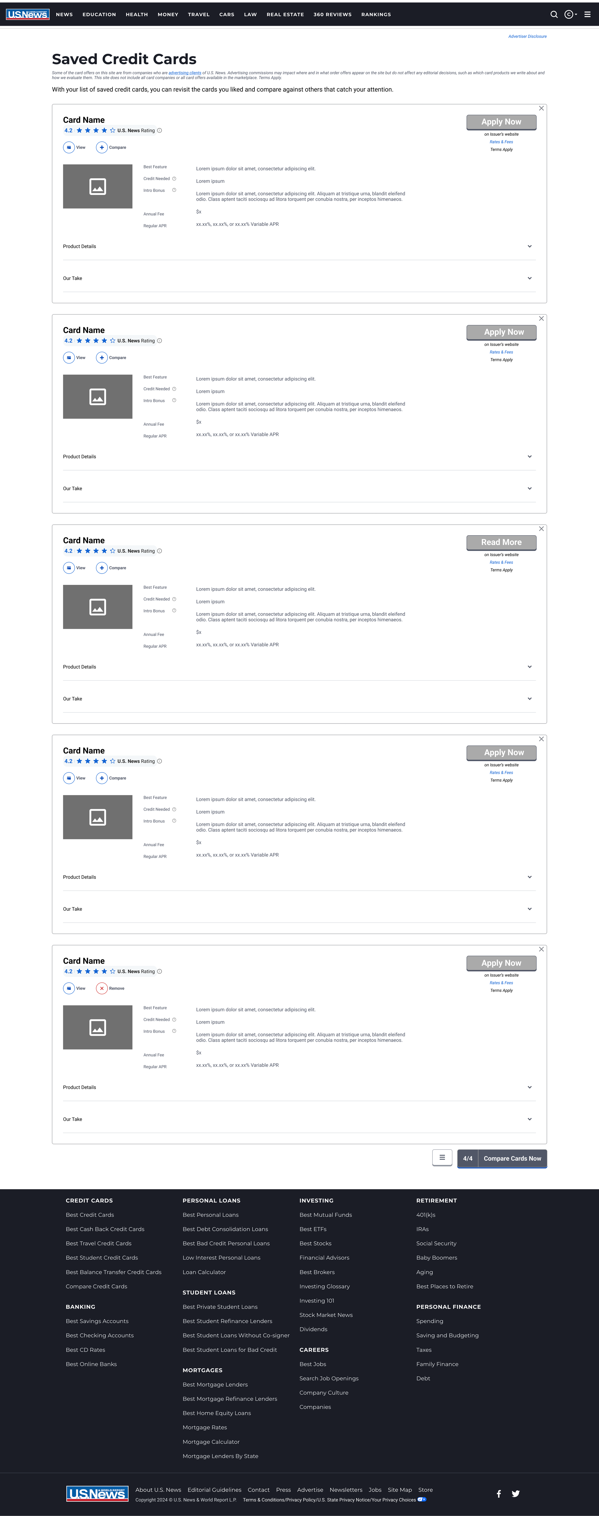
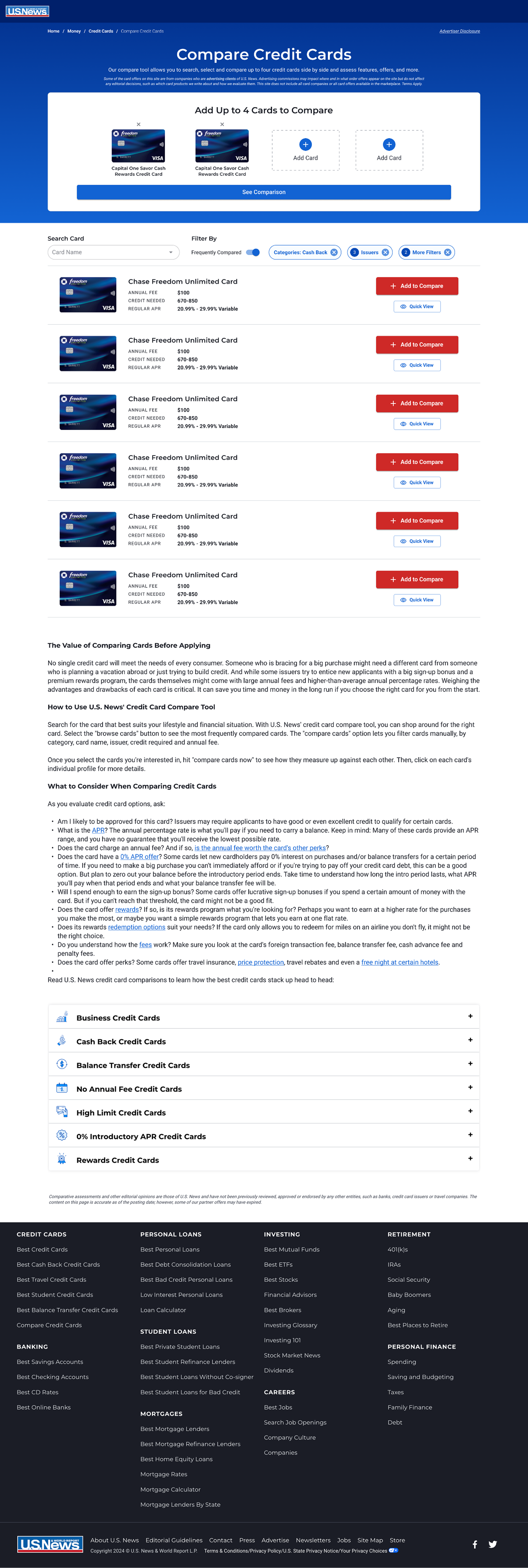
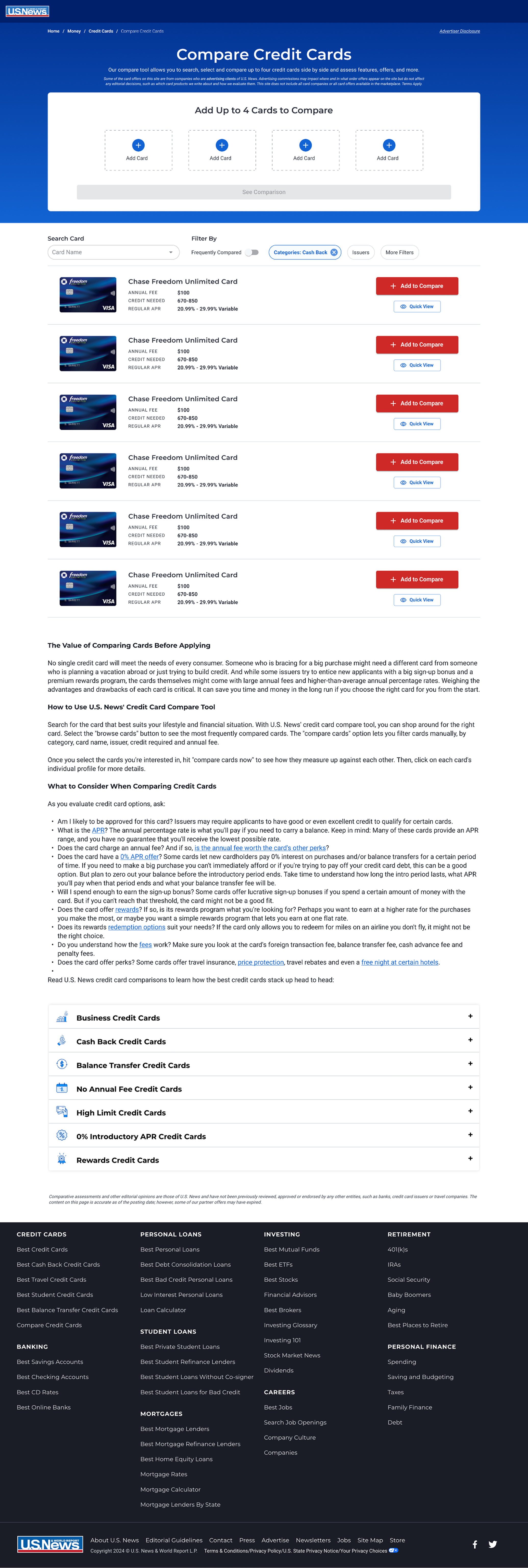
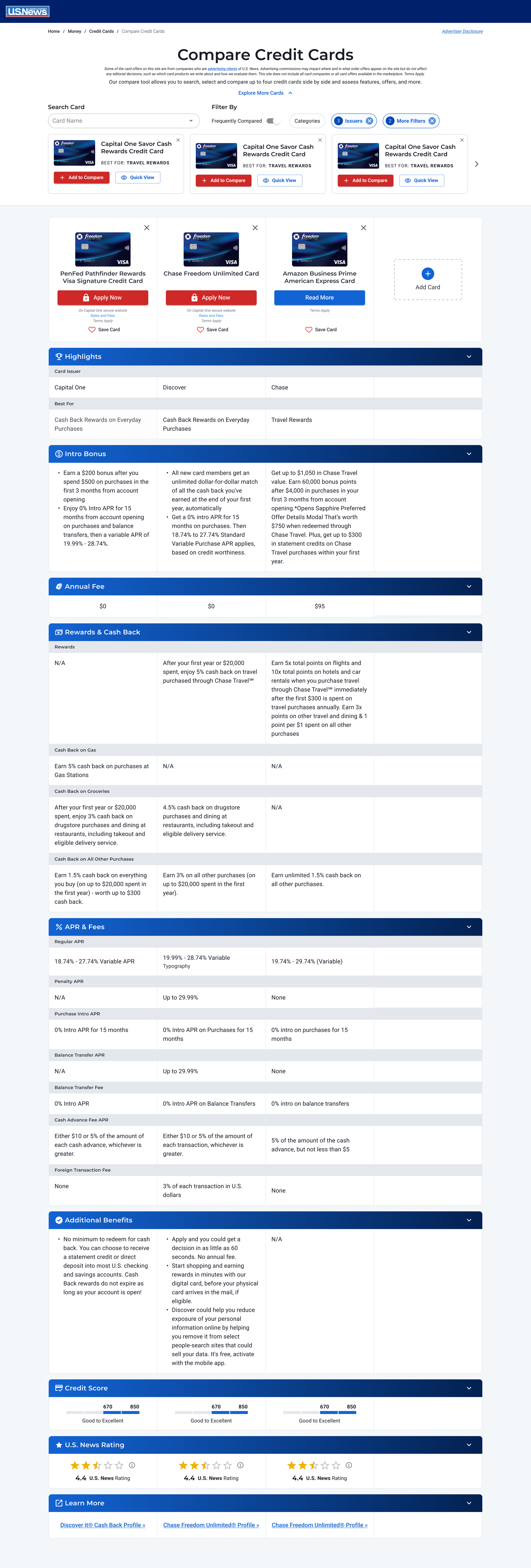
Complete re-design of the Credit Card Compare Tool that broke it into two separate pages for improved analytics tracking and compliance, while also making the experience feel like a more intuitive flow.
In addition, the organization was undergoing a major design system migration without a dedicated design system specialist. As part of this, I re-designed the entire tool using our new Material (MUI) React based component library, creating 10 new components in the process.
The Compare Table and Compare Table Header components became part of a huge globalized compare tool component project that involved multiple technology and product teams, which led to the creation of flexible components based on my design that could be used for different product vertical needs.

User Testing
Test Overview
Platform: UserTesting.com
Primary Task: Looking for a credit card to apply.
Search Preferences: Prefers a combination of methods to search and compare credit cards.
User Feedback - Desktop
Takes quite a bit to load
Default “Sort By” value was subjective and prefers to have the list be objective
“Additional Benefits” aren’t apples-to-apples and requires the user to read a lot and do more research
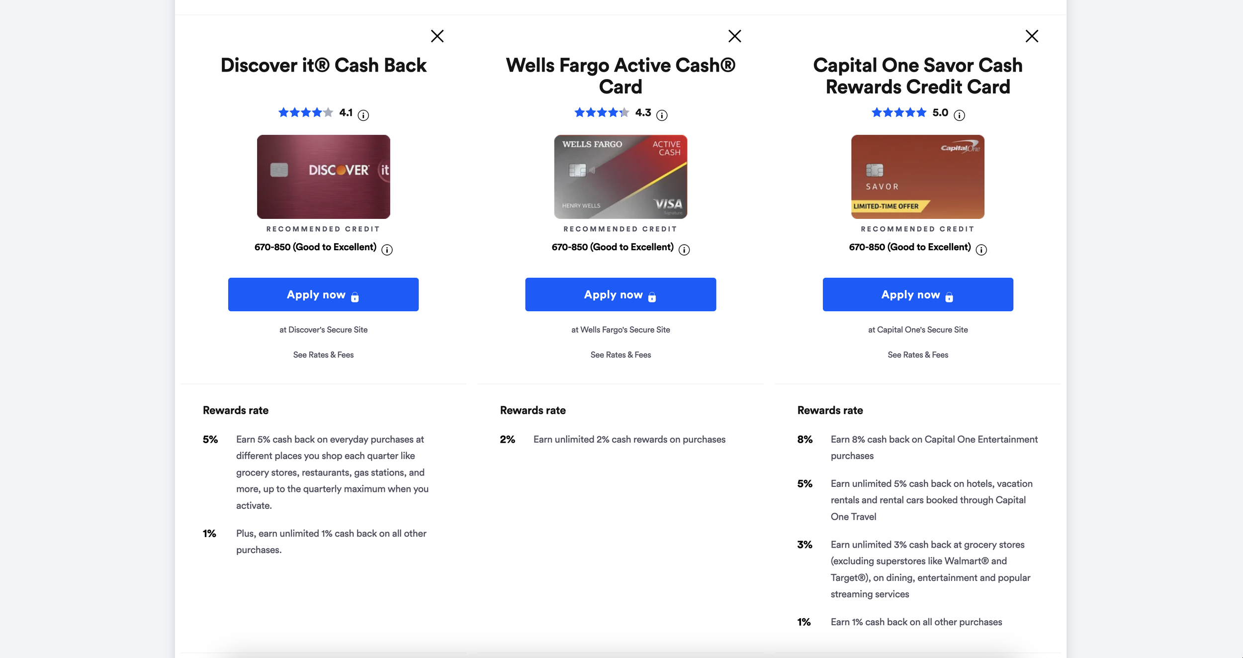
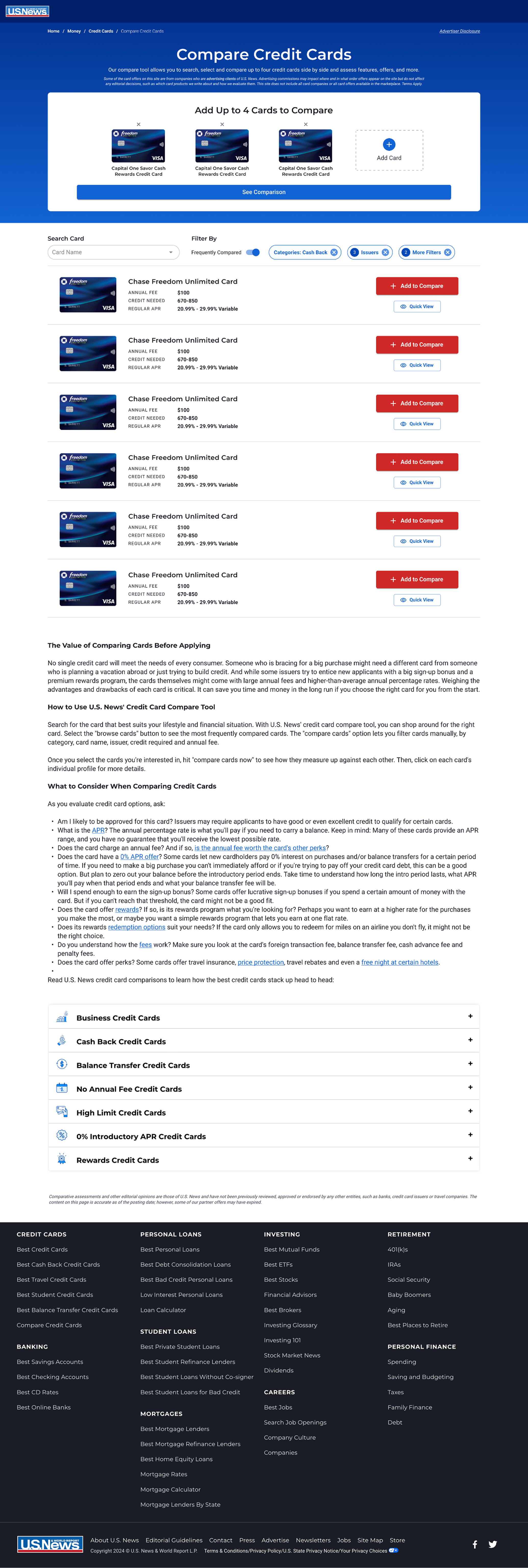
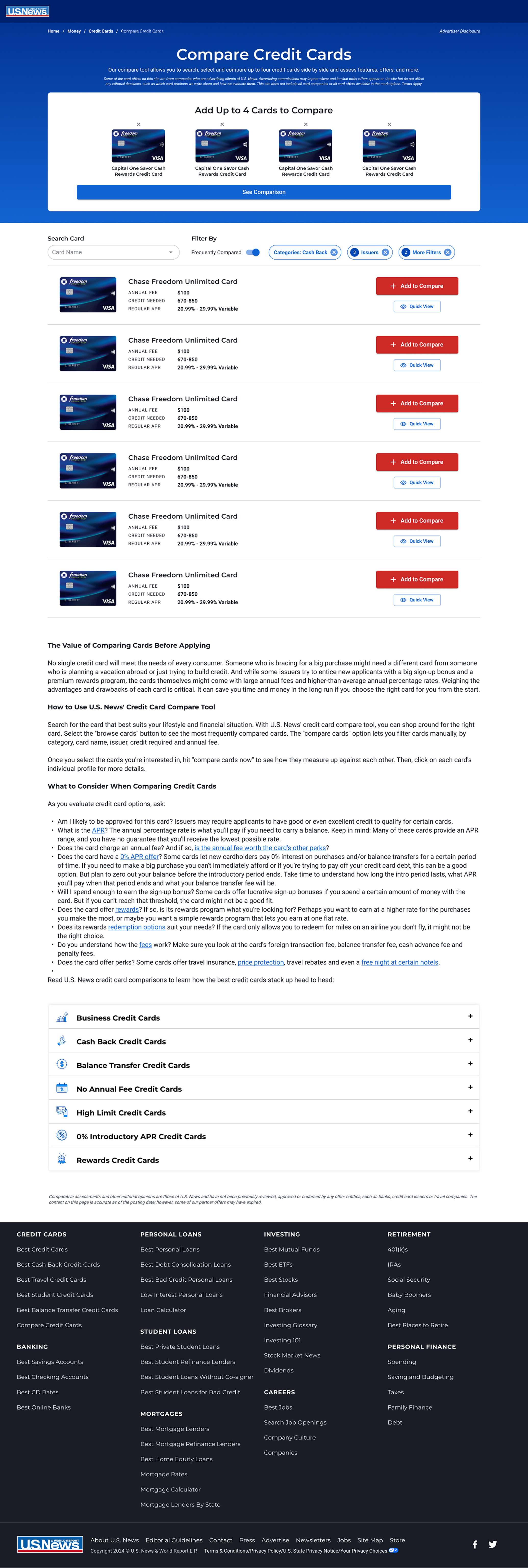
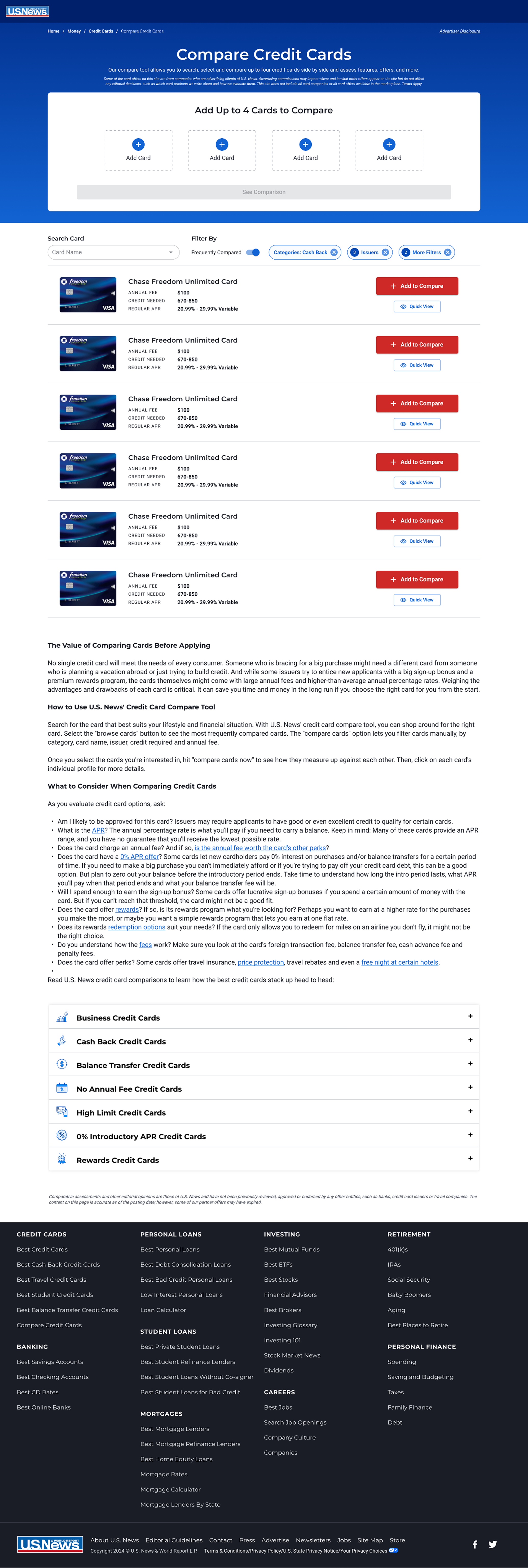
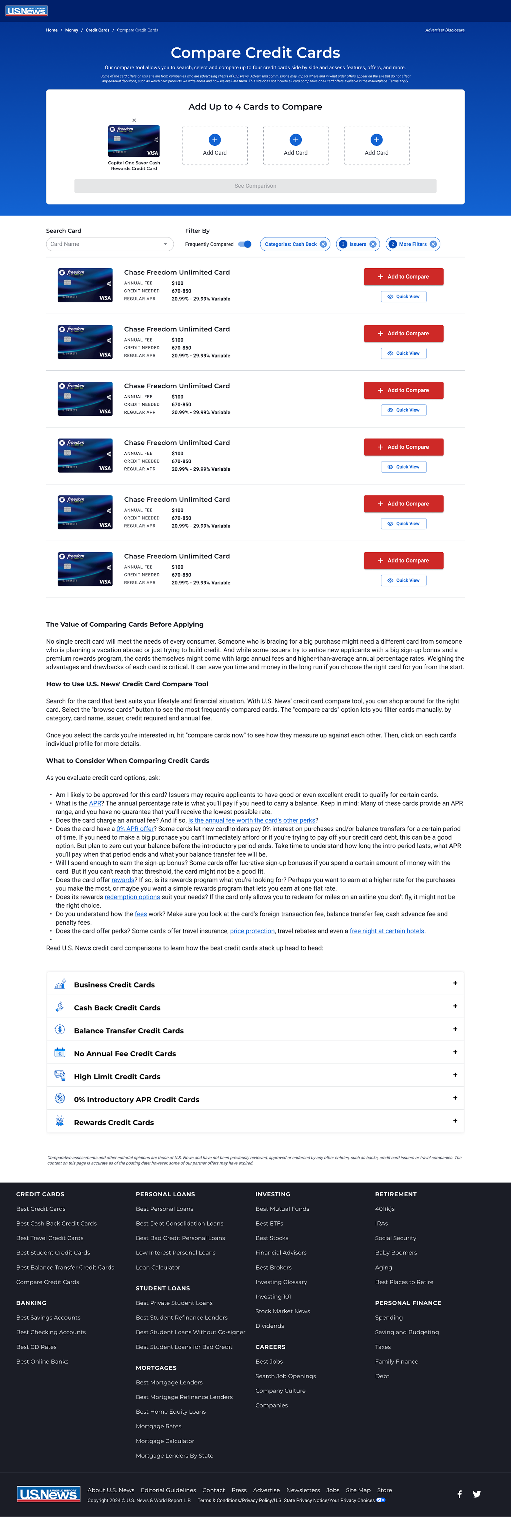
Want to see 4 cards rather than 3
Include all of our categories in the filter
Card detail box: have an Our Take section that is dedicated to the card itself regardless of what category its in and have a link to the full Profile
Best For section doesn’t really populate anything
Break up the Additional Benefits so that it’s easily readable
Eliminate Student cards unless the user specifically states that they are a student
Populate the USN star rating to the comparison table
A favorites tool or a save tool to mark the ones you’re thinking about applying for, but still want to do more comparing
Provide more of a breakdown on how we reviewed this card and ranked it against our 12 point scale
Real reviews/ratings from other users who may have applied for the same card and how they’re enjoying the card
Suggested cards or similar cards section to compare against the few selected
‘-’ and ‘N/A’ – caused some confusion according to the user, they prefer just being redirected to where that information can be found
For monetized cards, that’s information that flows from the API so if a card doesn’t offer BT options or have a cash advance fee, it seems logical to have ‘N/A’ or ‘-’
User Feedback - Mobile
Add additional filter options that pertain to data points (like Foreign Transaction fee)
Difficult to read all the information on a mobile device, would be easier to view on a desktop version
Having Frequently Compared results before the cards to compare on Mobile is confusing to the user; especially since she selected which cards to compare outside of the Compare Cards section
Include introductory APR if there is an Introductory APR value for the card
Redirect to the compare tool could be confused with the initial landing compare page
Reduce the items above the fold so that the user can see the results above the fold on mobile
Load time took too long and confused the user to the point where he ended up in a different part of our site
The Browse Card pill is confusing to the user. He’s expecting to be able to click on that pill and search for a card
Suggest other cards that are similar to the ones the user chose to compare
Provide a dollar value conversion for the points that are being offered for a card (AmeX gold card example) – I think this isn’t really actionable because depending on the card, a different intro bonus is offered.
Key Takeaways
Improve our load time.
Include more categories to filter and choose from.
Display up to 4 cards for a user to compare against.
Our search tool was less valuable to users than the compare tool.
The “Browse Cards” and “Compare Cards” buttons and screen-states seem to be confusing some users.
Potentially provide more suggestions on different cards that could be available
Display less content at the top of the page(s) so that users don’t have to scroll as much or get confused.
However, many users want more information about specific cards and/or certain information isn’t highlighted or easily visible.


Competitive Analysis
I analyzed the desktop and mobile credit card compare tools of the top two competitors, NerdWallet and Bankrate, as well as Forbes, Wallet Hub, Yahoo Finance, Chase, and Bank of America. Additionally, I reviewed dozens of successful and unsuccessful compare tables using Baymard, a UX resource website that has conducted user research on thousands of products. This was especially helpful in the ideation process, since the legal team hasn’t given approval for product teams to conduct user interviews.


Wireframes
I put together some quick desktop wireframes to help facilitate discussions with the product team about how adding a fourth card column, a horizontal filter bar, and more condensed detail cards, and other large changes would look. In the interest of time, I skipped mobile wireframes, among other reasons, because adding a fourth column wouldn’t change the fact mobile would still require a horizontal scroll.
Due to the speed at which the business prefers work at, I usually don’t make wireframes at U.S. News, except for very large projects like this. I’ve made more extensive wireframes with different screen sizes for other U.S. News projects such as the brand new ASC (Ambulatory Surgery Center) rankings. However, I usually just start exploring and experimenting with different designs in Figma using our design system based on the requirements and research.


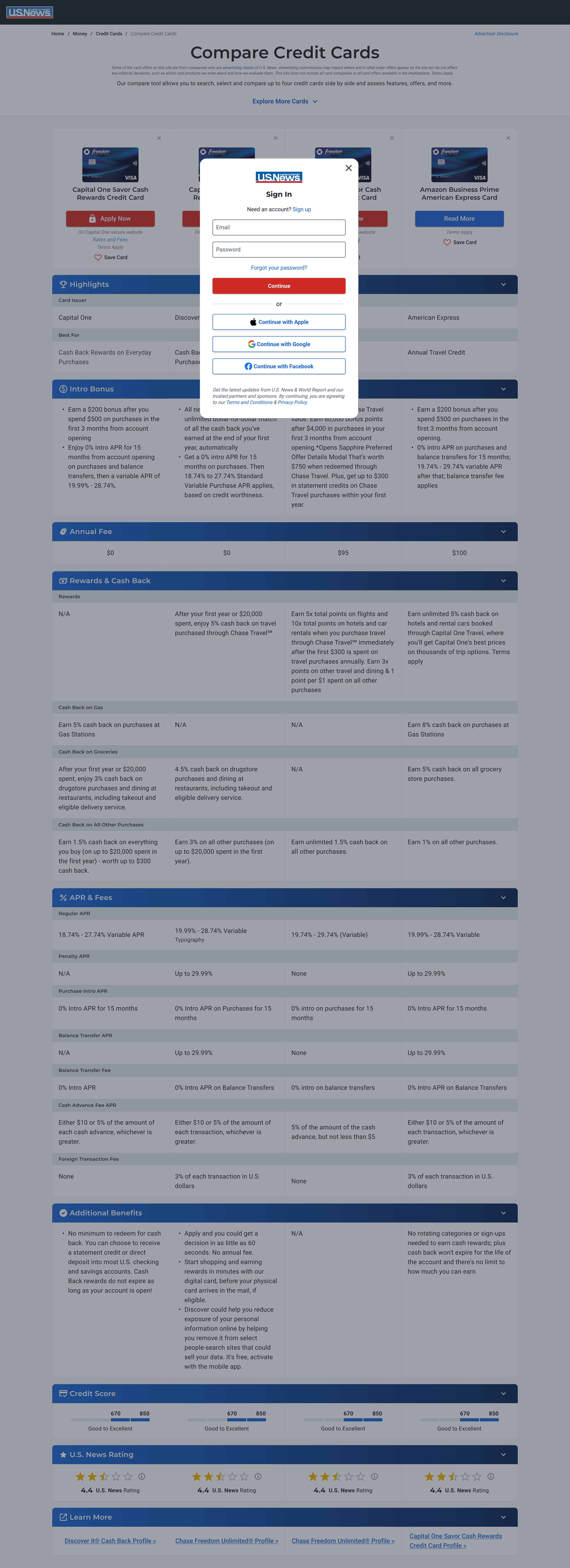
Final Desktop Mockups


Outcome
Projected to significantly increase several important business metrics including conversion rate and overall user satisfaction.
The new global Compare Table components will also be implemented across other product verticals including Health, Careers and Education and give any other product verticals a modern, flexible and easy to implement solution.
In total, 10 new global components were created for the new design system.